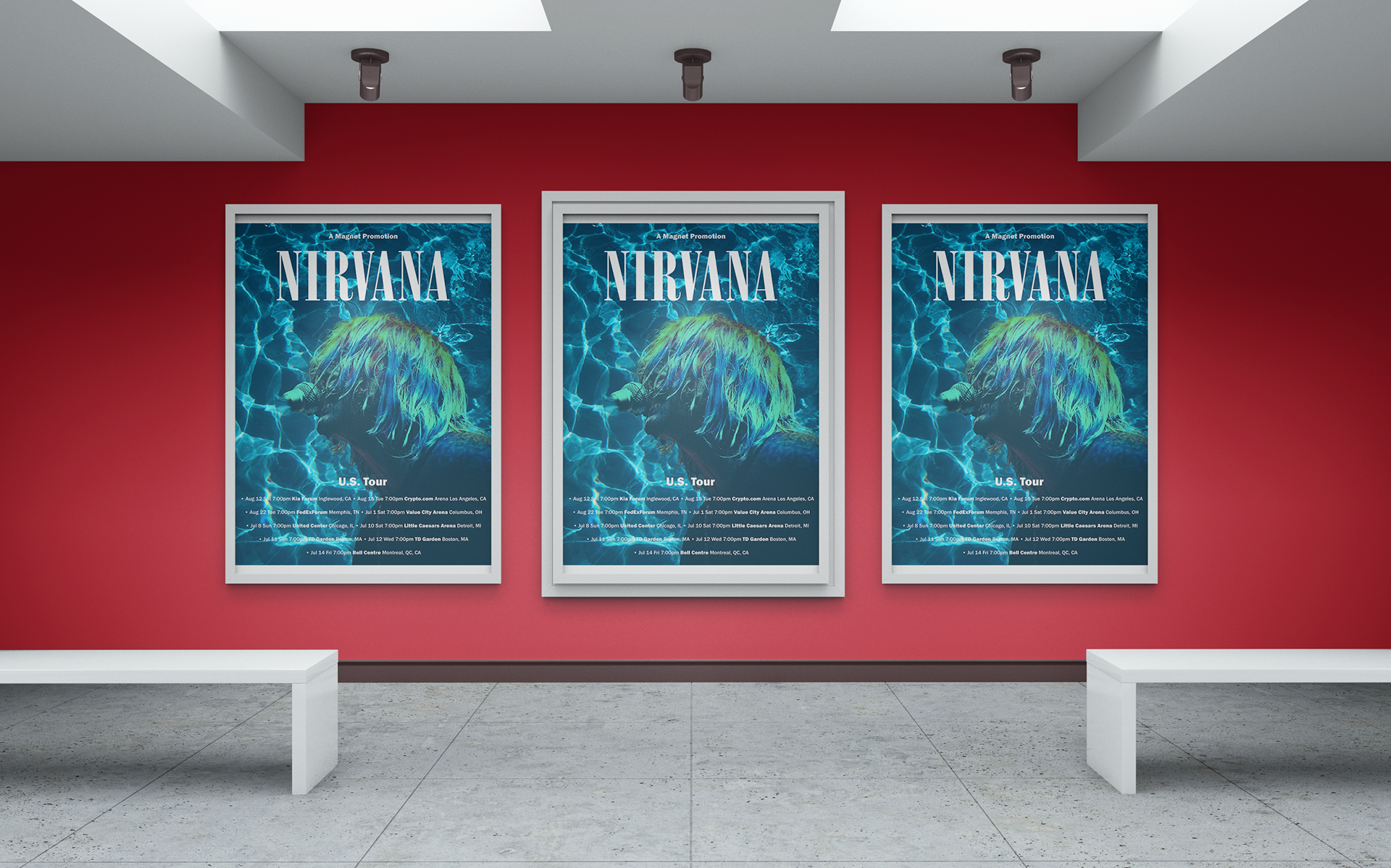
Nirvana Tour
I developed The following project to show my poster and billboard design skills. I have been a huge Nirvana fan since I was a kid, and I thought creating a fantasy tour featuring the band would be fun. I essentially "resurrected" Kurt Cobain and imagined what the tour posters and billboards would look like. While researching, I saw that Nirvana posters were typically surreal, raw, and gritty. So I decided to take that spirit and create a contemporary take on it. Here, I imagined what a Nirvana poster would look like if they performed today.
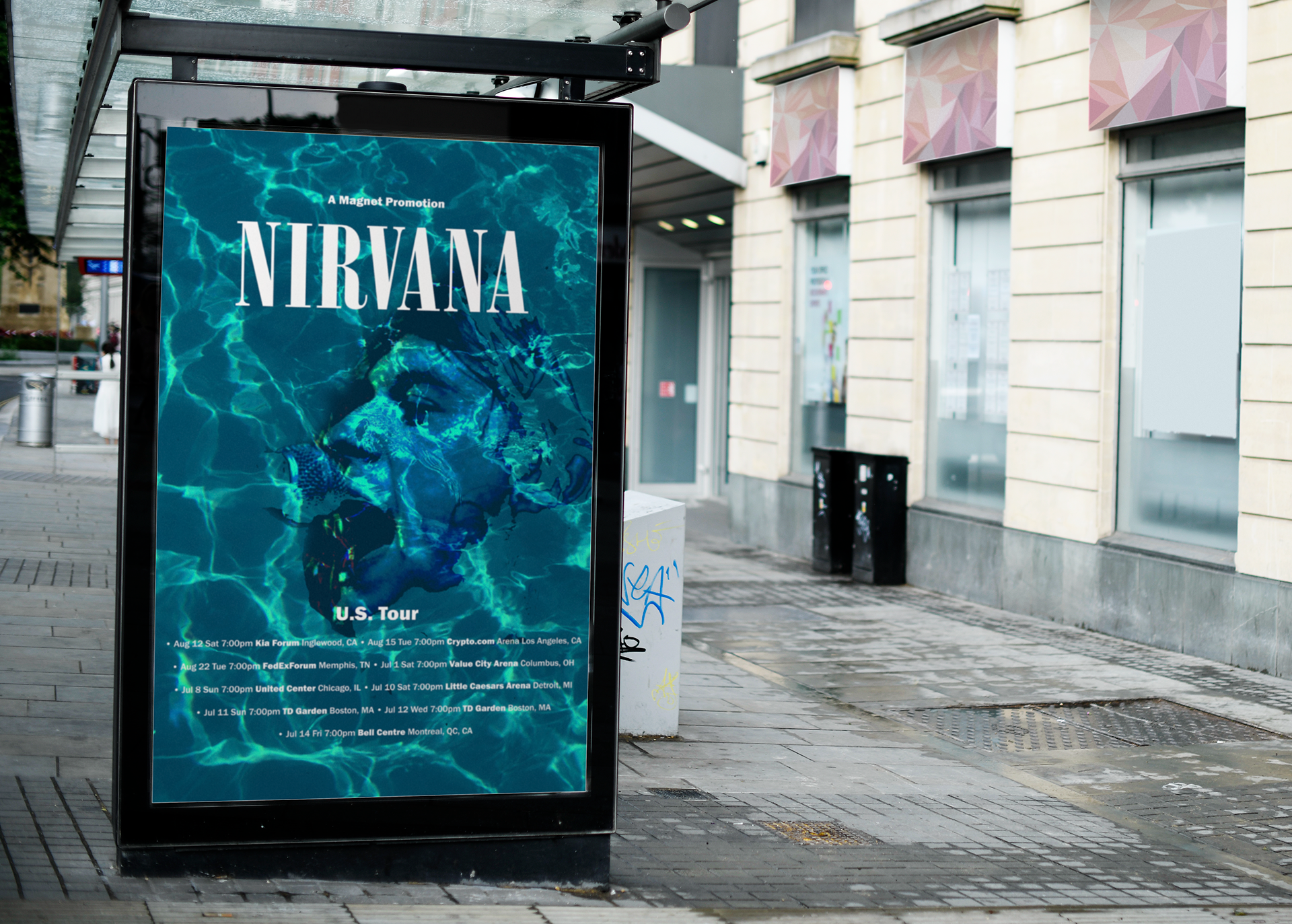
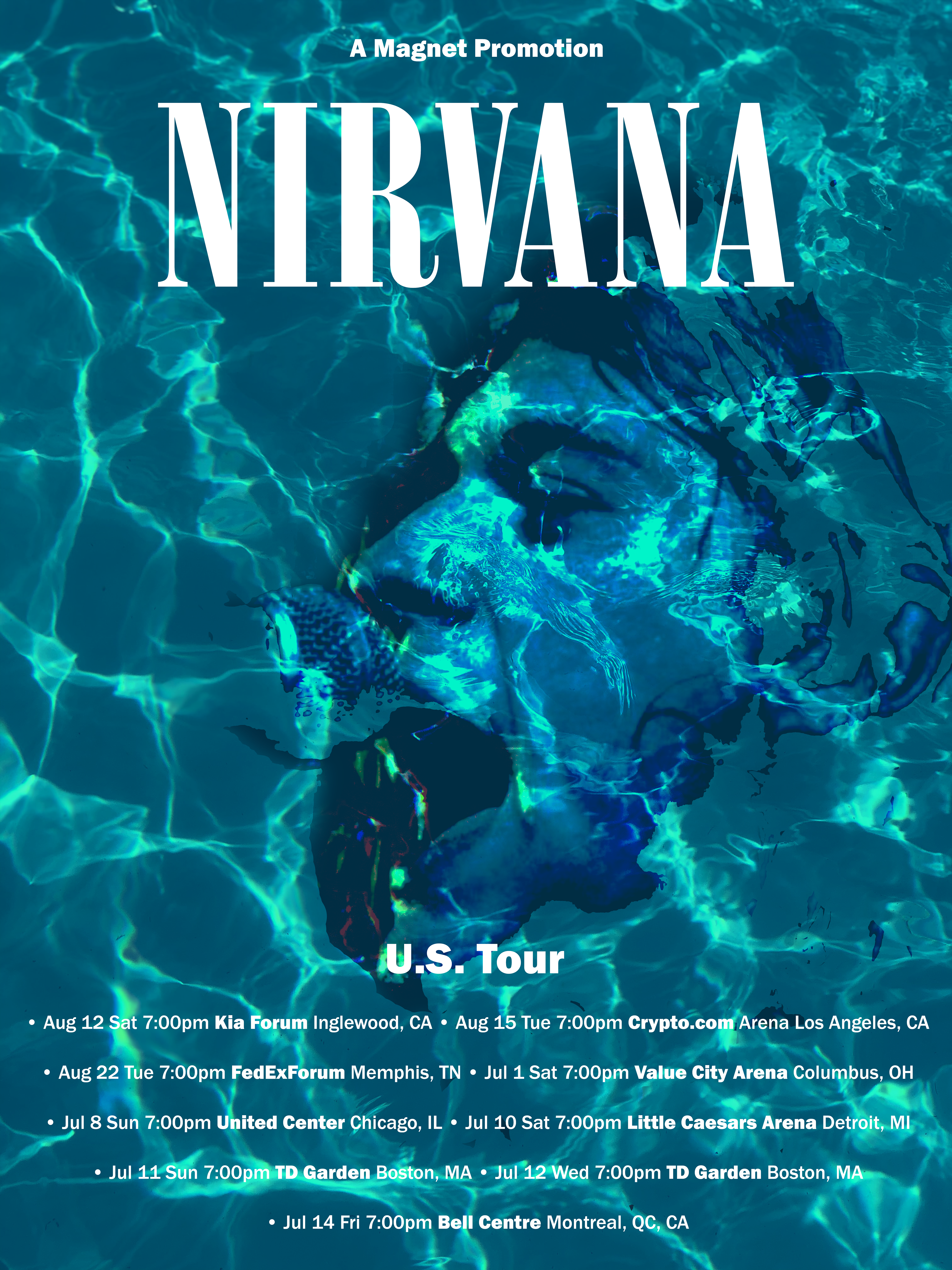
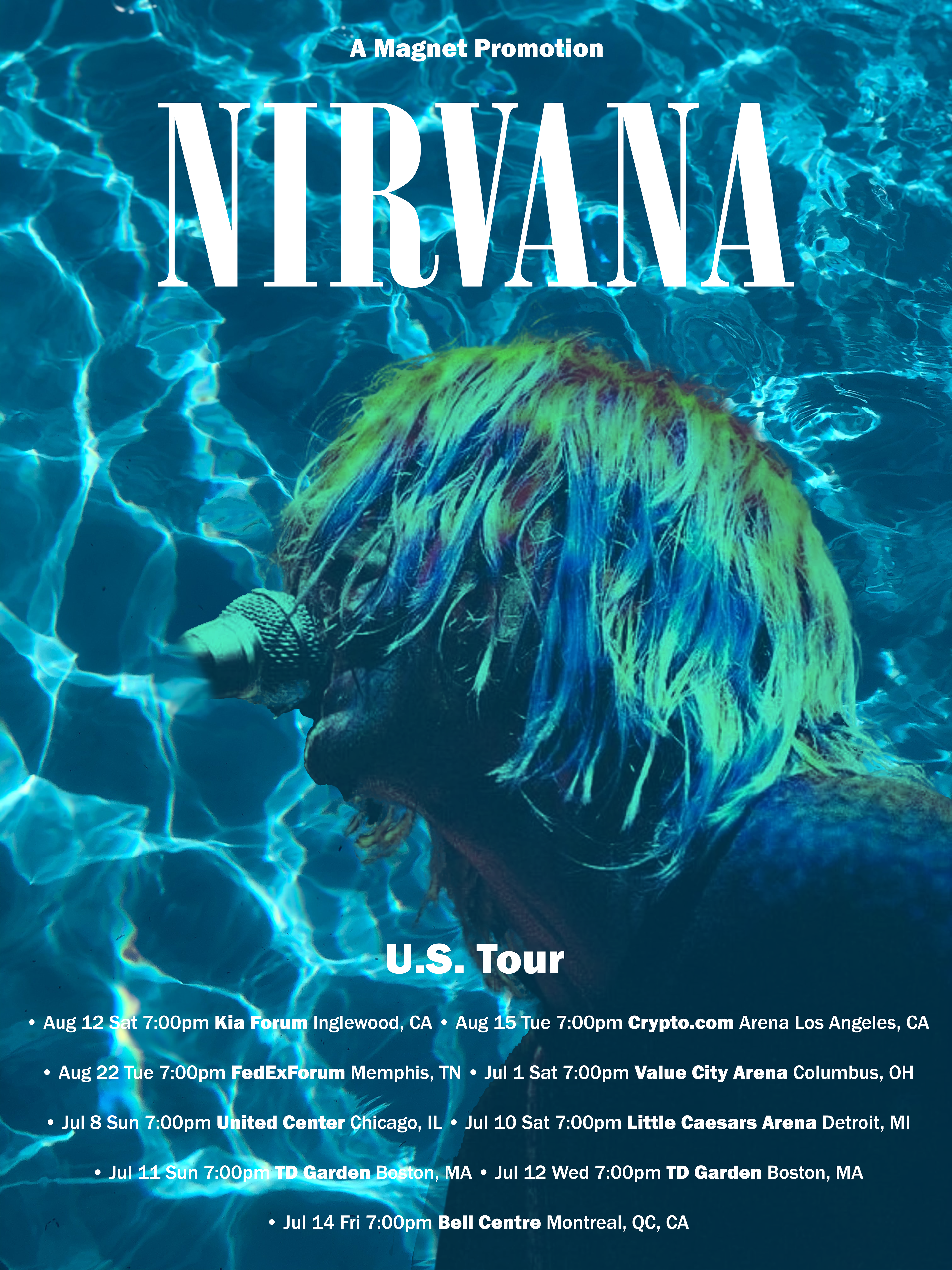
Nirvana Tour: Nevermind
Next, I wanted to use the Nevermind album cover's water theme to create something that reflected the band's spirit and visual themes. I tried to capture Kurt Cobain's passion and the visual aesthetic he and his bandmates wanted to portray in their artwork.
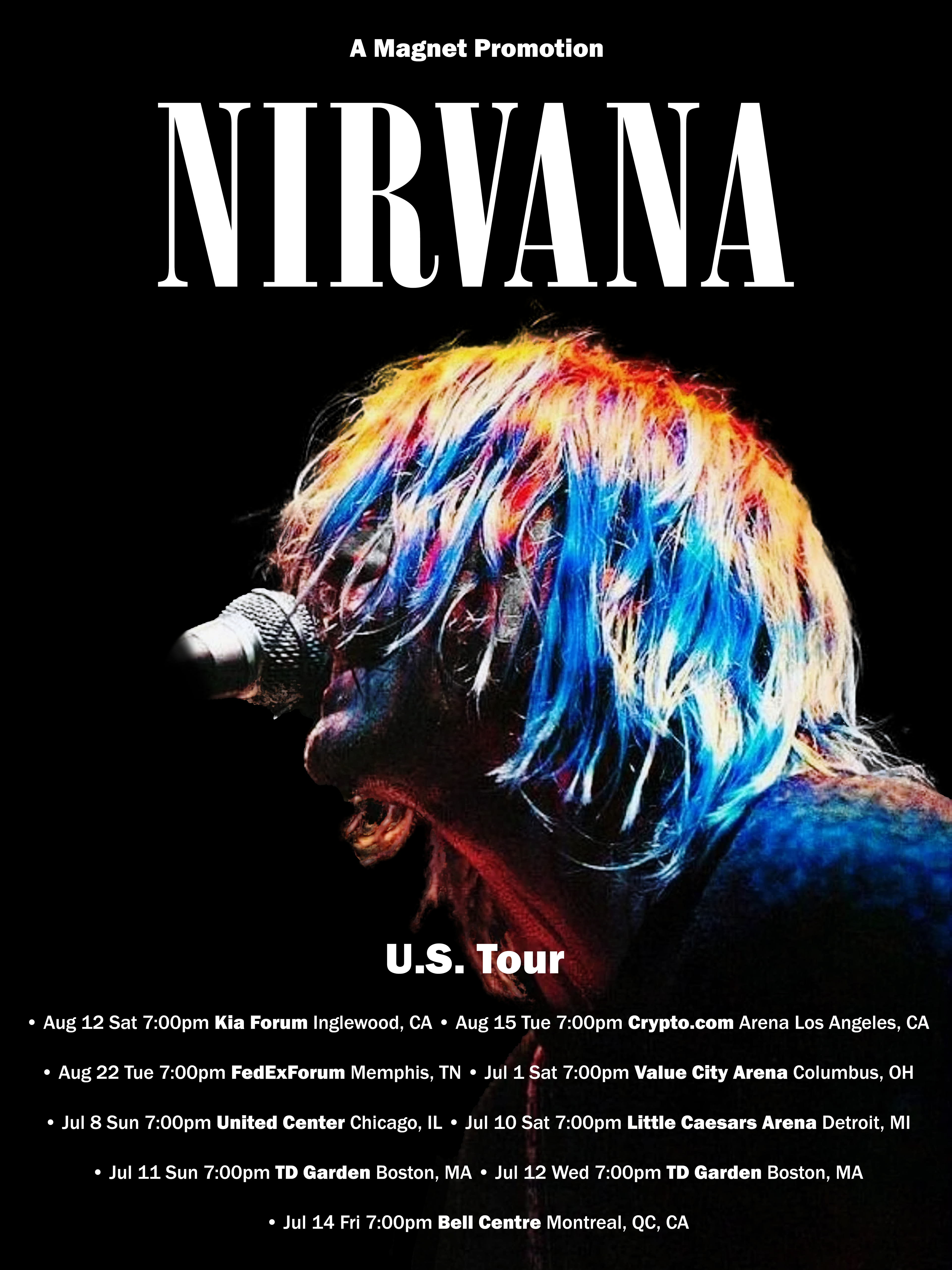
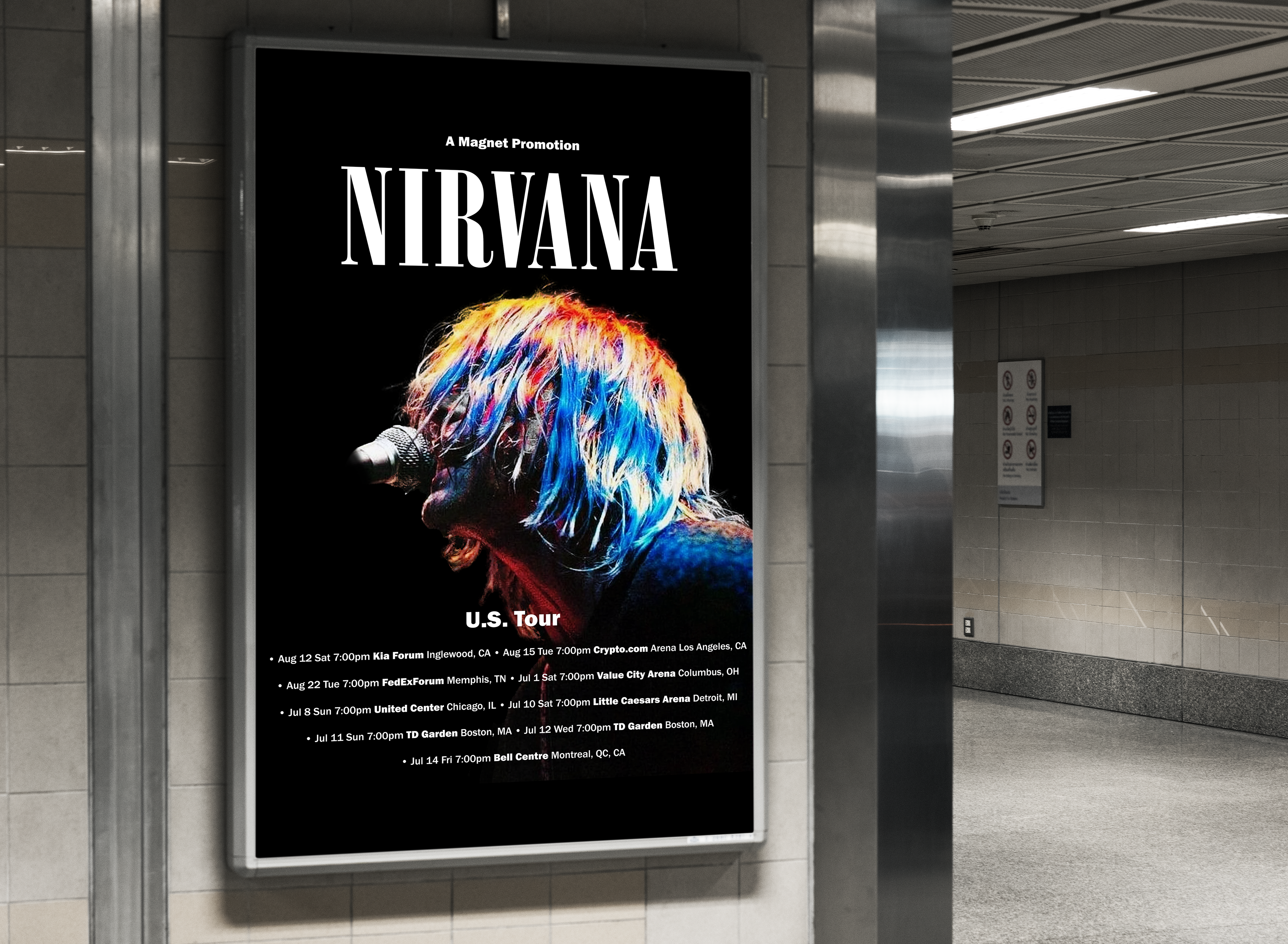
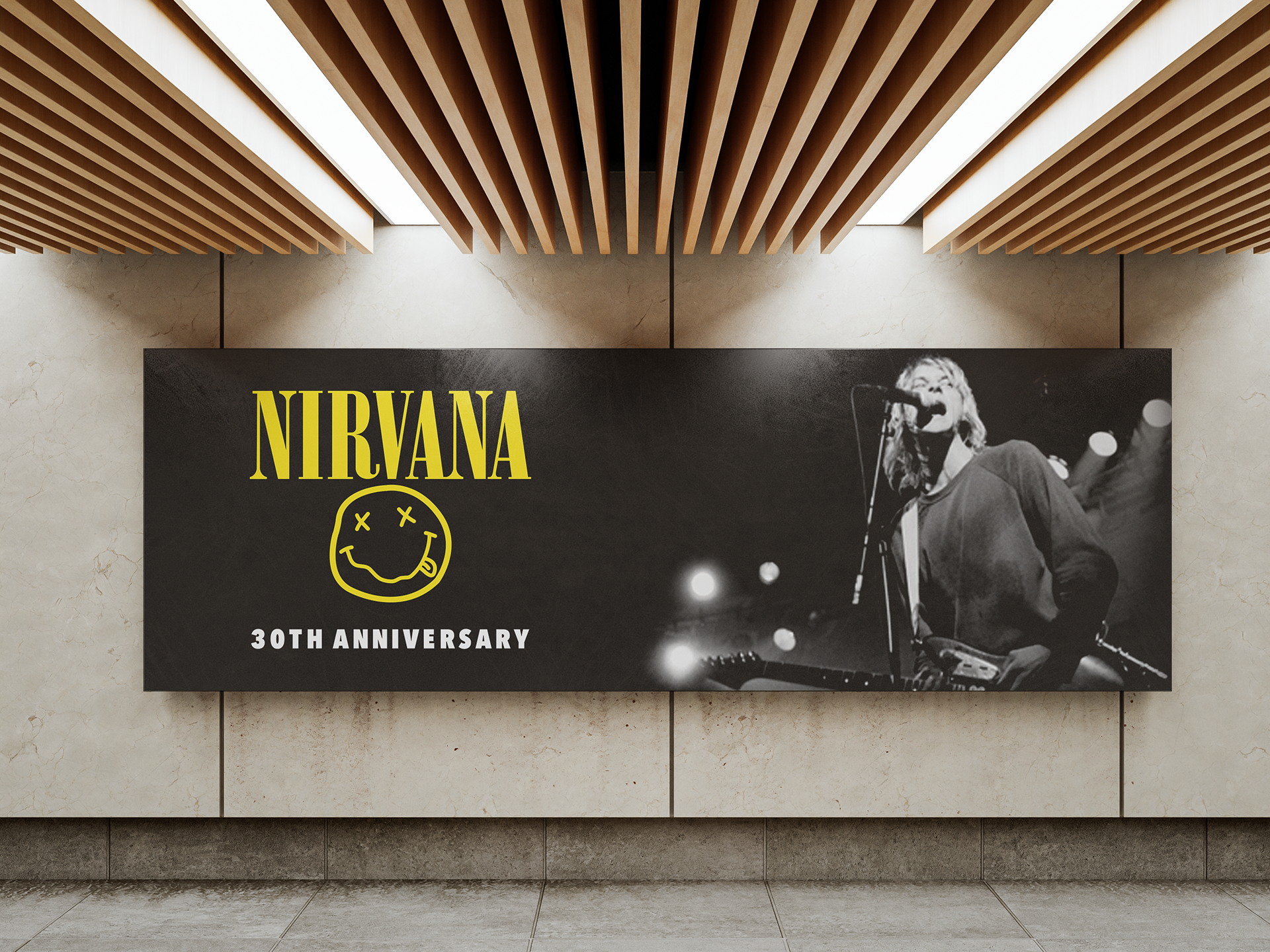
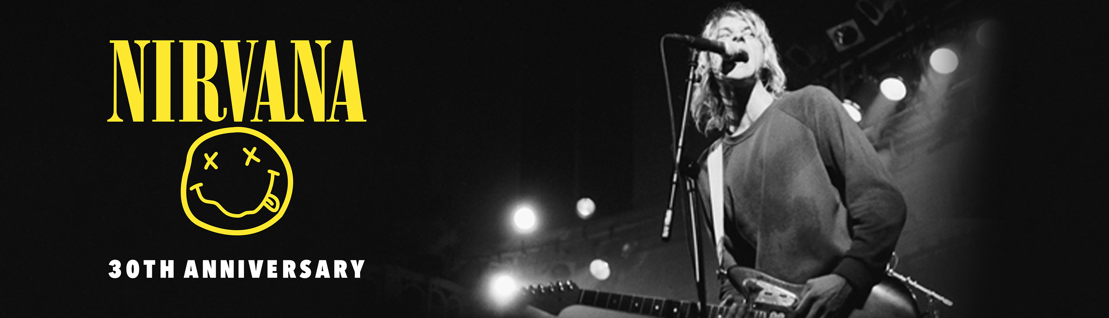
Nirvana: Reunion Tour
Next, I wanted to create a mock advertising campaign for a fantasy anniversary tour for Nirvana if Kurt Cobain was still alive and willing. I made two billboard ads to advertise this tour and wanted to capture the gritty nature of the band with this first design.
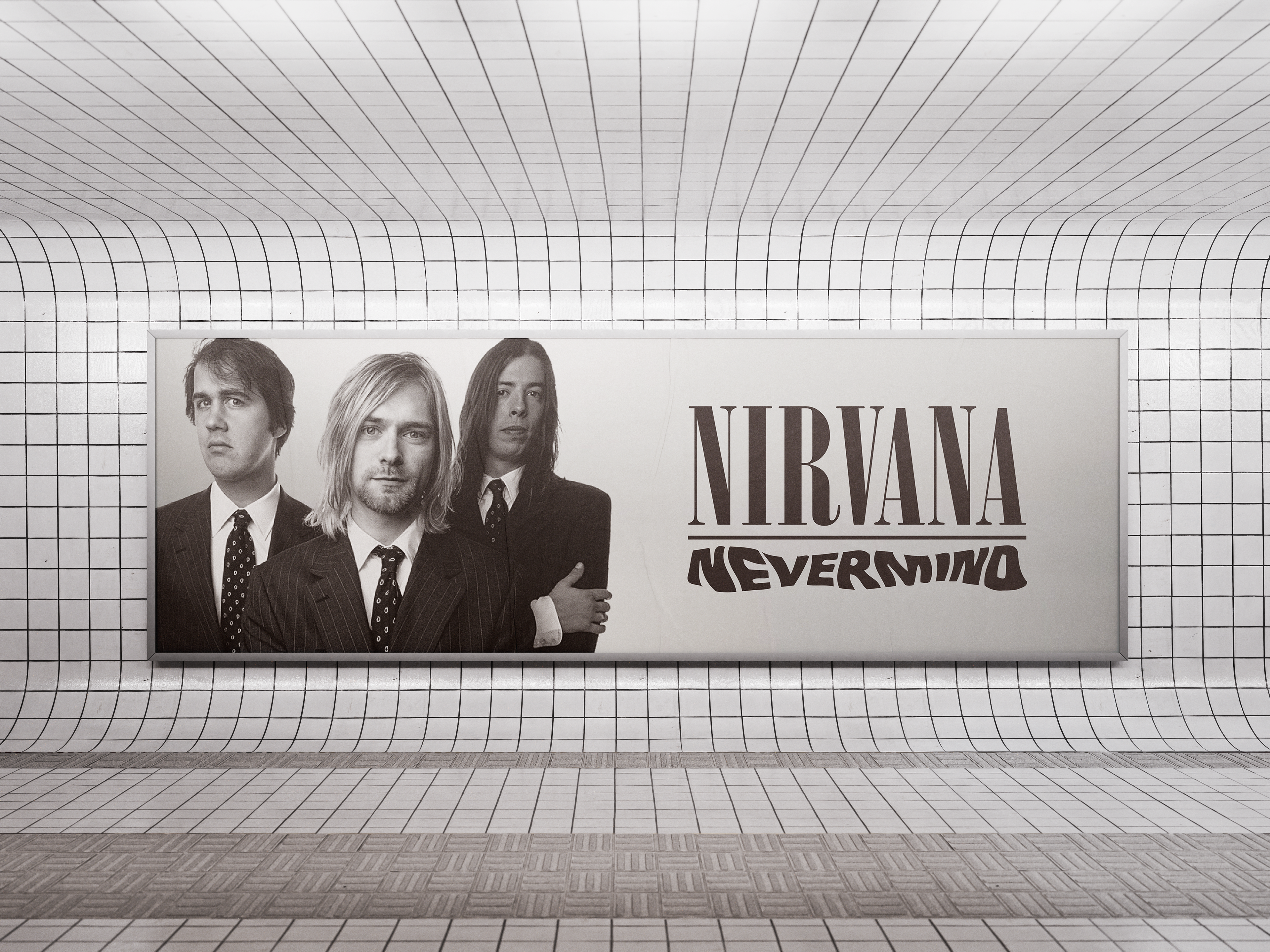
Nirvana: Reunion Tour 2
Next, I switched things up and ironically portrayed the band in suits and ties. I used black and white to create a classic, vintage feel, and I used their classic artwork from their most famous designs.

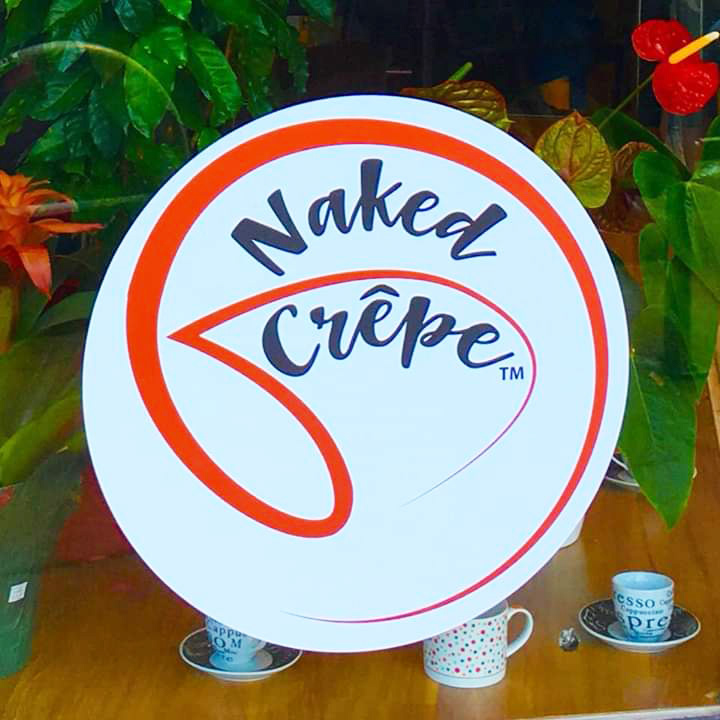
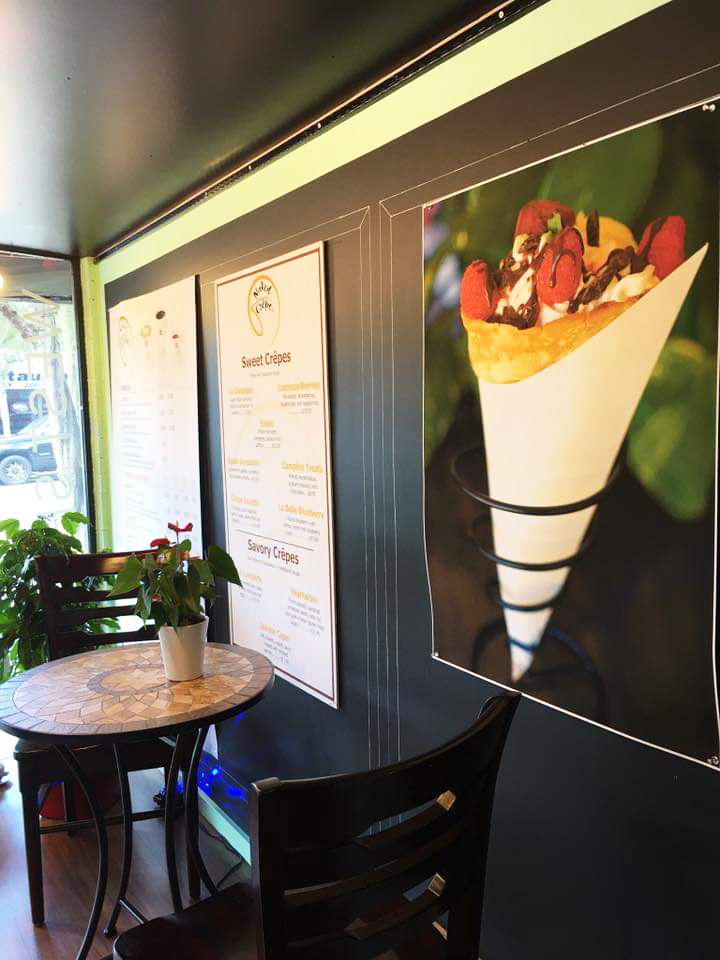
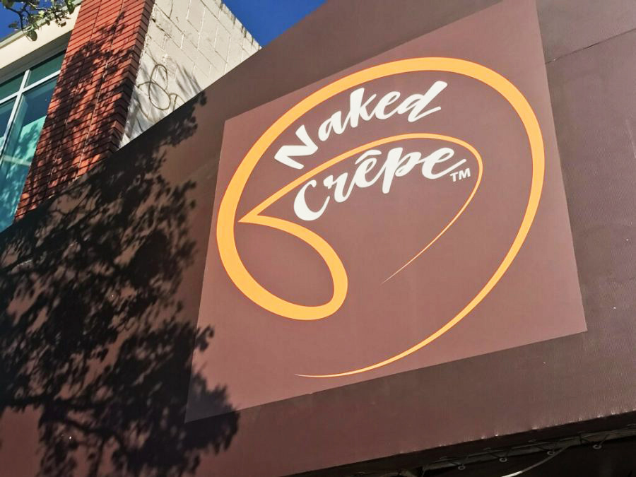
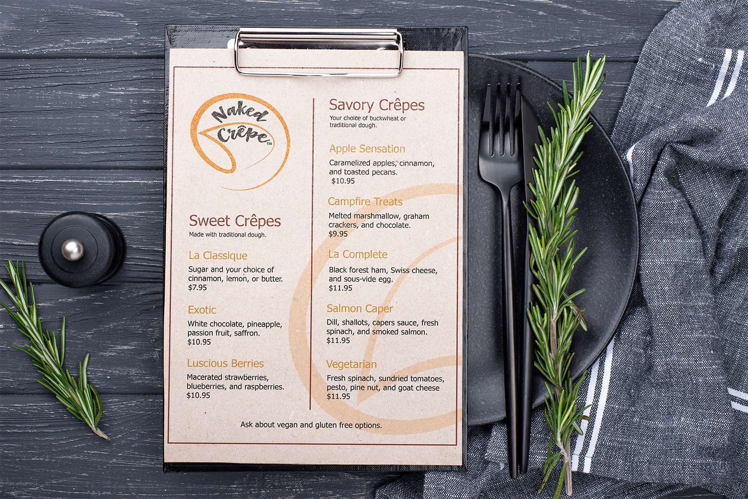
Naked Crepe
I designed the logo and menu for this booming restaurant located in the West Seattle Junction. The restaurant is owned by Jacques Nawar who's other restaurant, Pizzeria Credo, was featured on the show Diners, Drive-Ins and Dives on the Food Network.

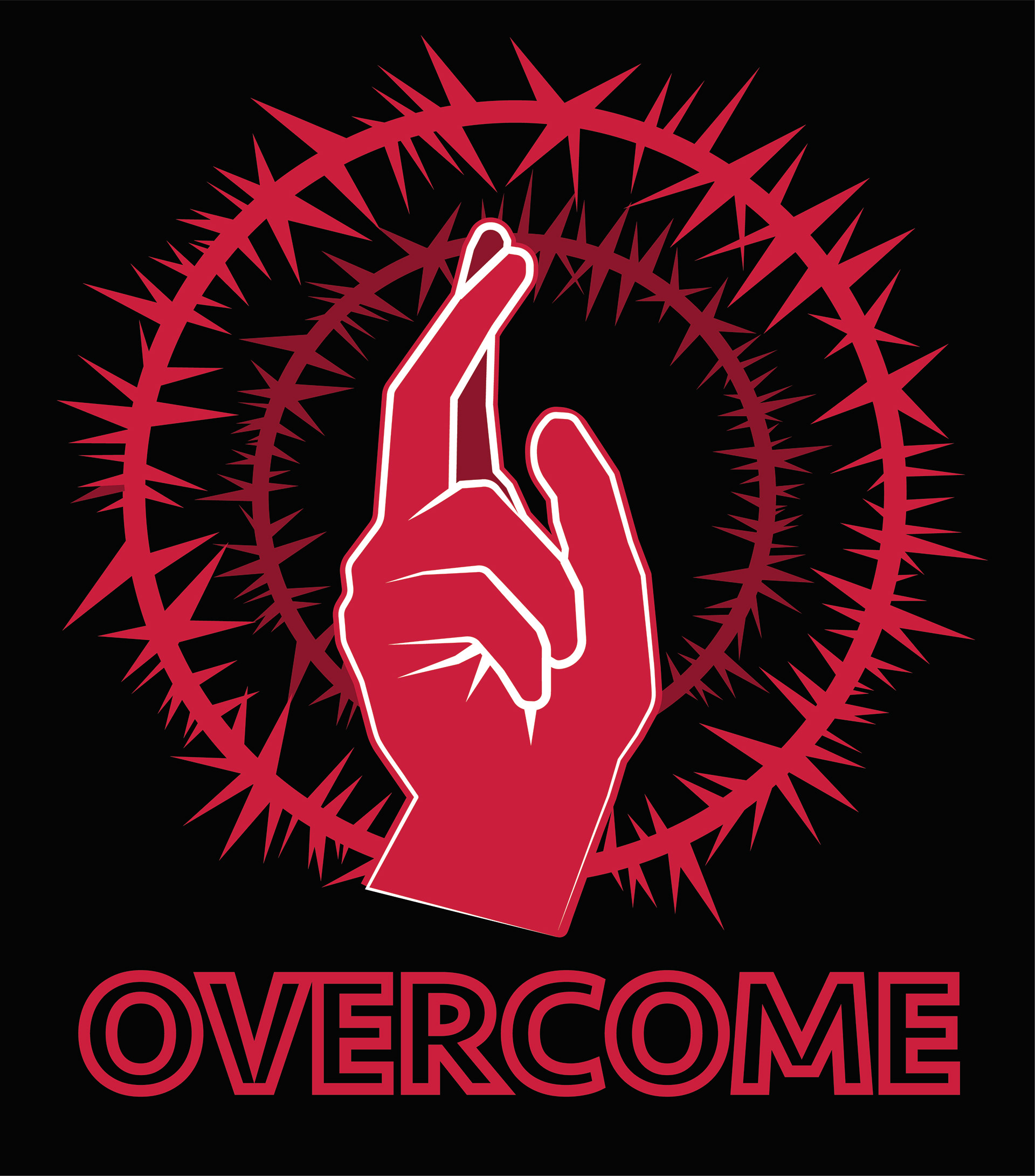
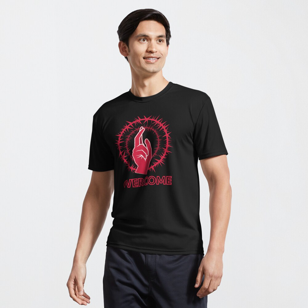
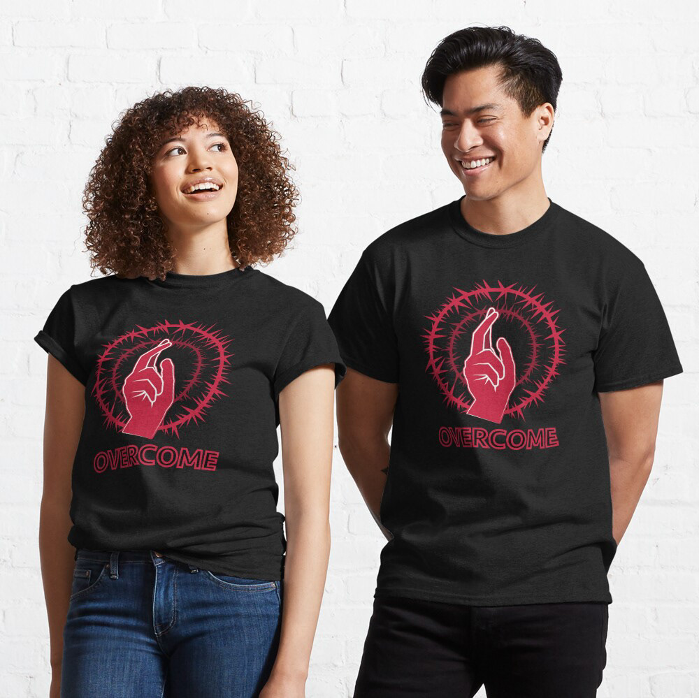
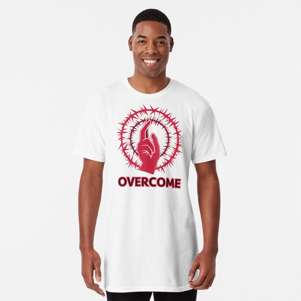
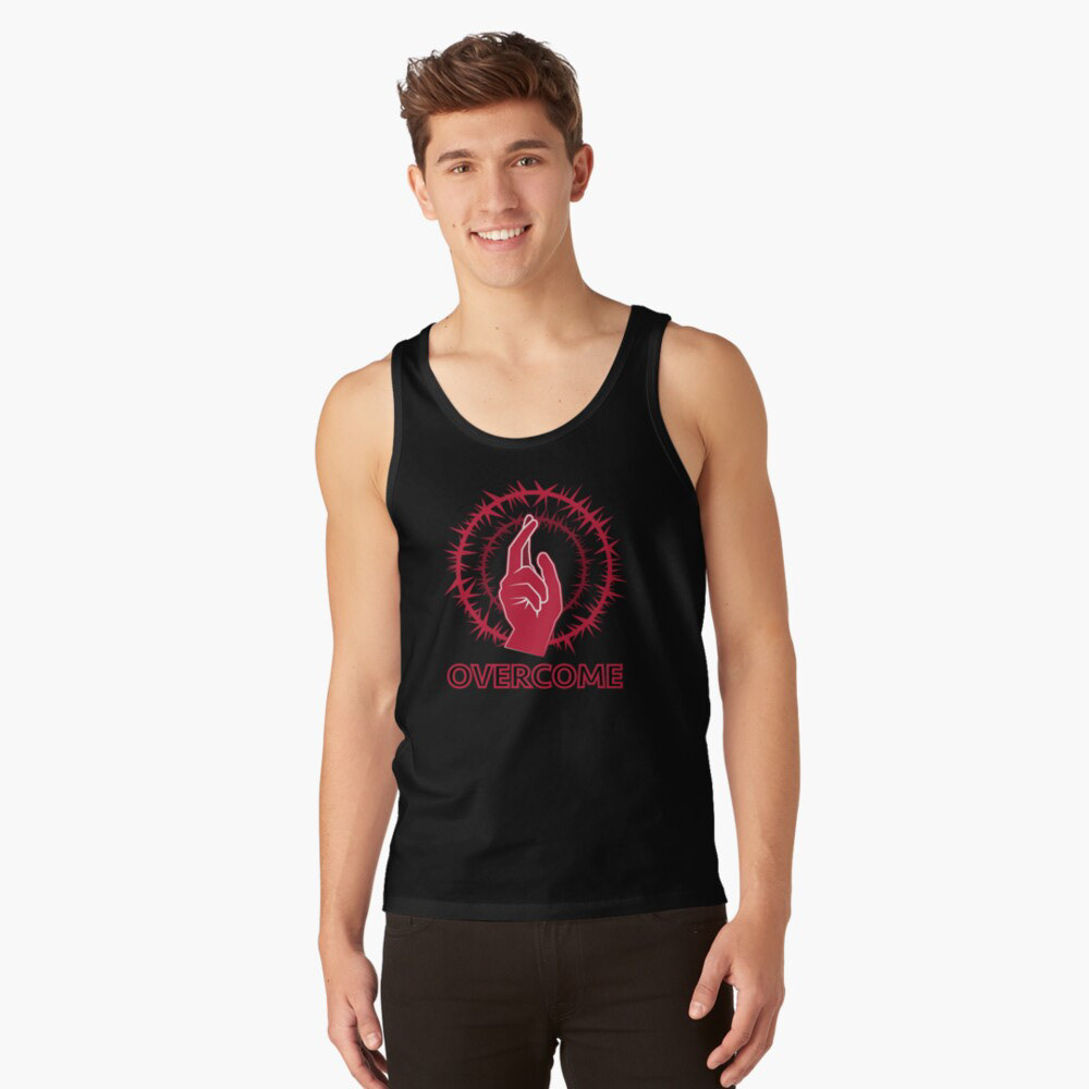
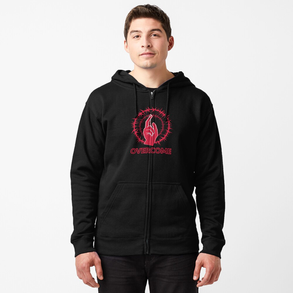
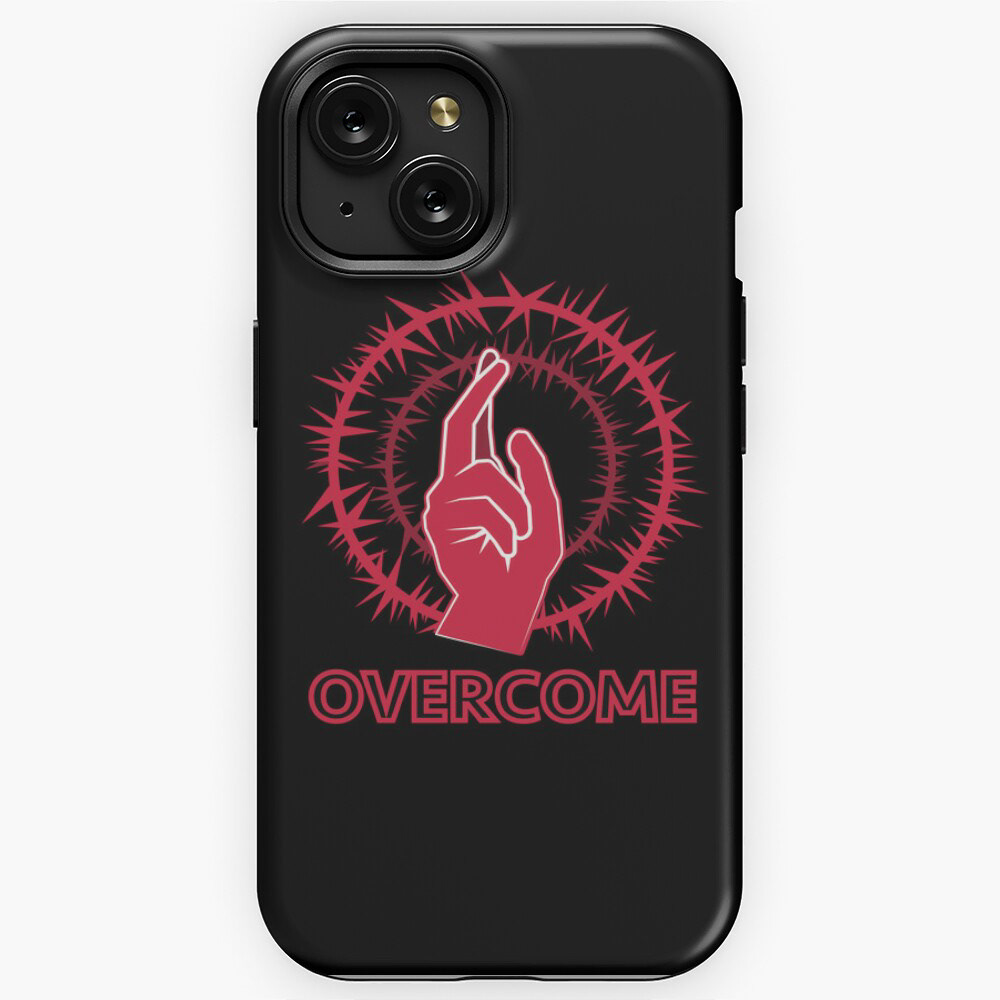
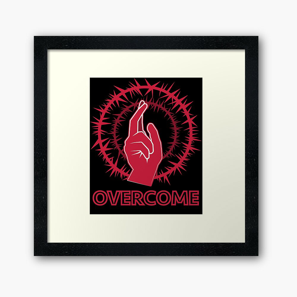
"Overcome" Inspired by the Jesus Mudra
Creating the design with a fist surrounded by thorns reminded me of classic Christian art. I always really liked classic religious art. The suffering it showed while remaining beautiful always fascinated me. If you look at my "Art" section, I'm a bit obsessed with halos, too. I decided to borrow a famous symbol from that art and, in this case, use thorns from the Christian concept of a crown of thorns. The hand gesture is familiar in depictions of Jesus throughout medieval and Renaissance art, and I always thought it looked cool. Millions of people around the world share the Christian faith, and this would be an excellent product to offer them.
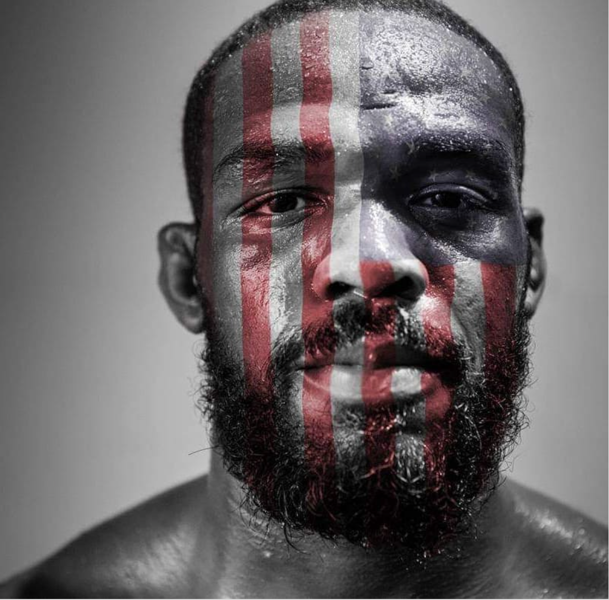
Jone Jones American Flag Face Paint
Jon Jones is a famous American athlete. He competes in mixed martial arts in the UFC. He is considered the greatest fighter of all time and recently moved up a weight class and captured the UFC heavyweight championship. I wanted to take a powerful image of Jon and apply an overlay of the American flag to his face. I wanted to represent his nature as a man willing to endure tremendous adversity and portray him as a proud American.
TPIRC: Biological Medical Technology
I designed this image with a biological tech company called TPIRC in mind. It is a non-profit clinical care and research center. They often advertise their ability to approach complex diseases in a novel way. I created a design that is used for social media to portray their approach and promote their message meaningfully.

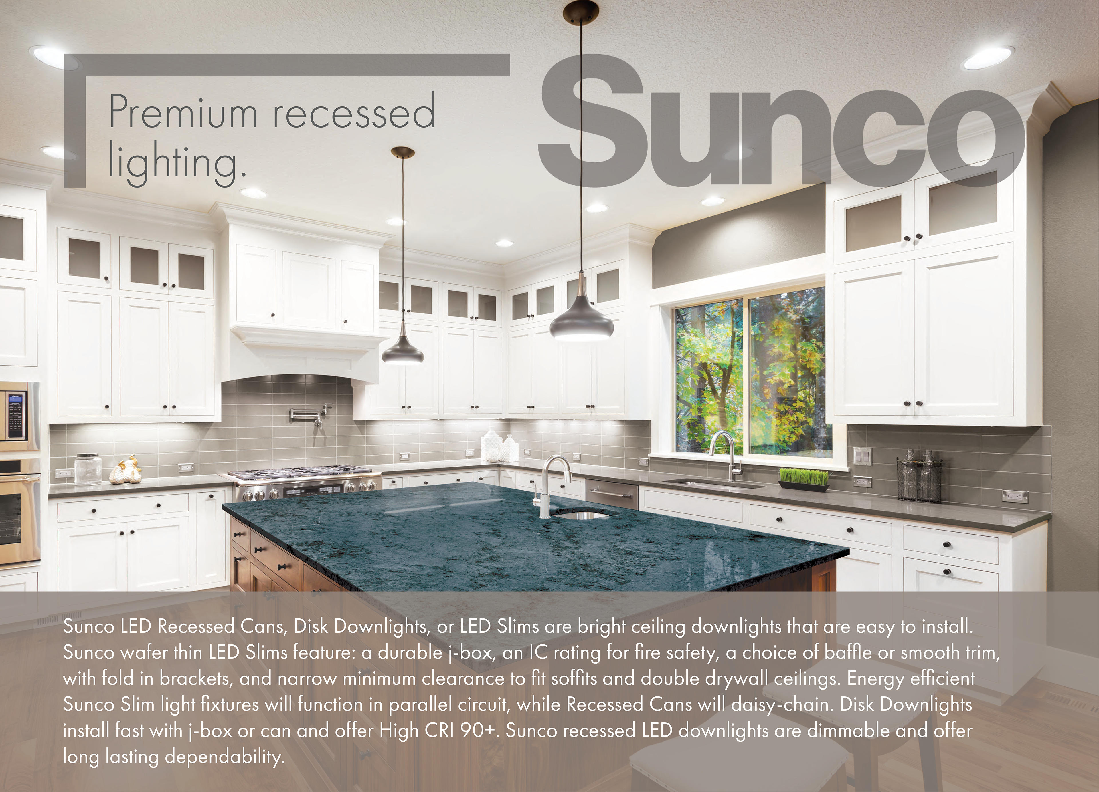
Sunco Lighting
These are designs for advertisements in either print or web format. I approached this to reflect the industry standards for indoor lighting advertisements while expressing the company's unique attributes in focus. This first design is for ceiling lighting. I wanted to show the beautiful product without limiting my ability to convey the information necessary for the consumer to view. I made the logo and heading transparent to keep the product in view and added a description below that matched the colors and theme.
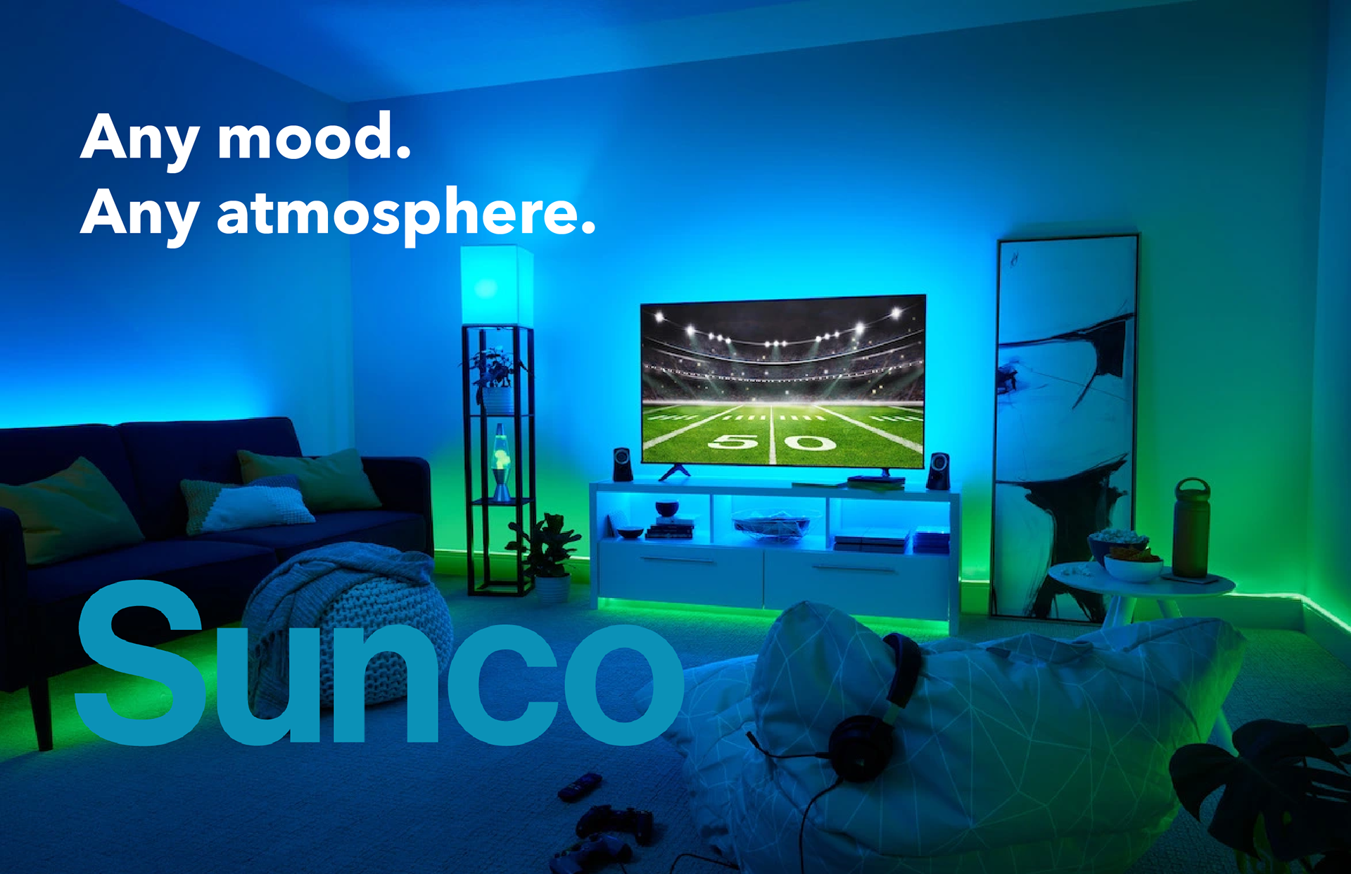
Sunco Lighting: Smart Lighting
This advertisement is for smart lighting, lighting fixtures, and light bulbs that can sense and interact automatically with their environments, users, and other smart devices. The user can adjust the colors to create the desired atmosphere and look. Here, the consumer matched their favorite football team's colors.
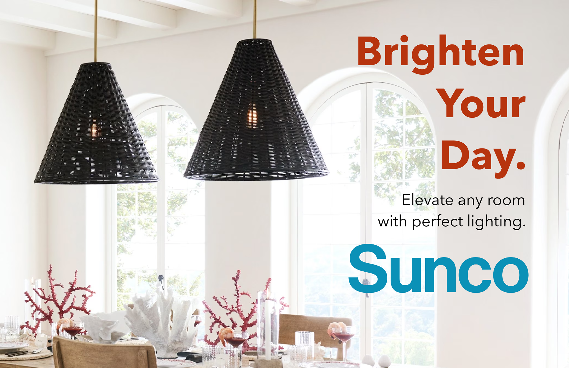
Sunco Lighting: Pendants (Hanging Light Fixtures)
This advertisement is for lighting fixtures. I wanted to portray a bright and lively environment with a color profile that borrows from the image in view. The text is coral because of the coral placed on the table in the picture. Also, the Sunco logo is sea blue, which complements my selected coral color.
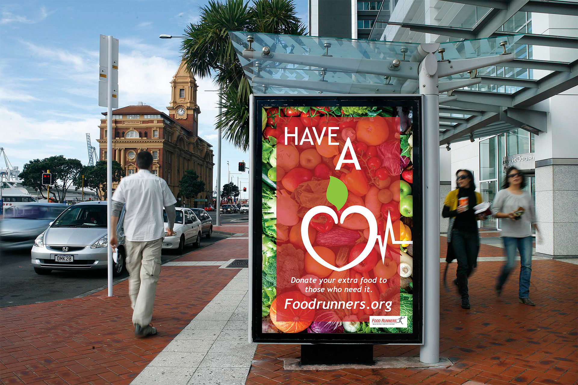
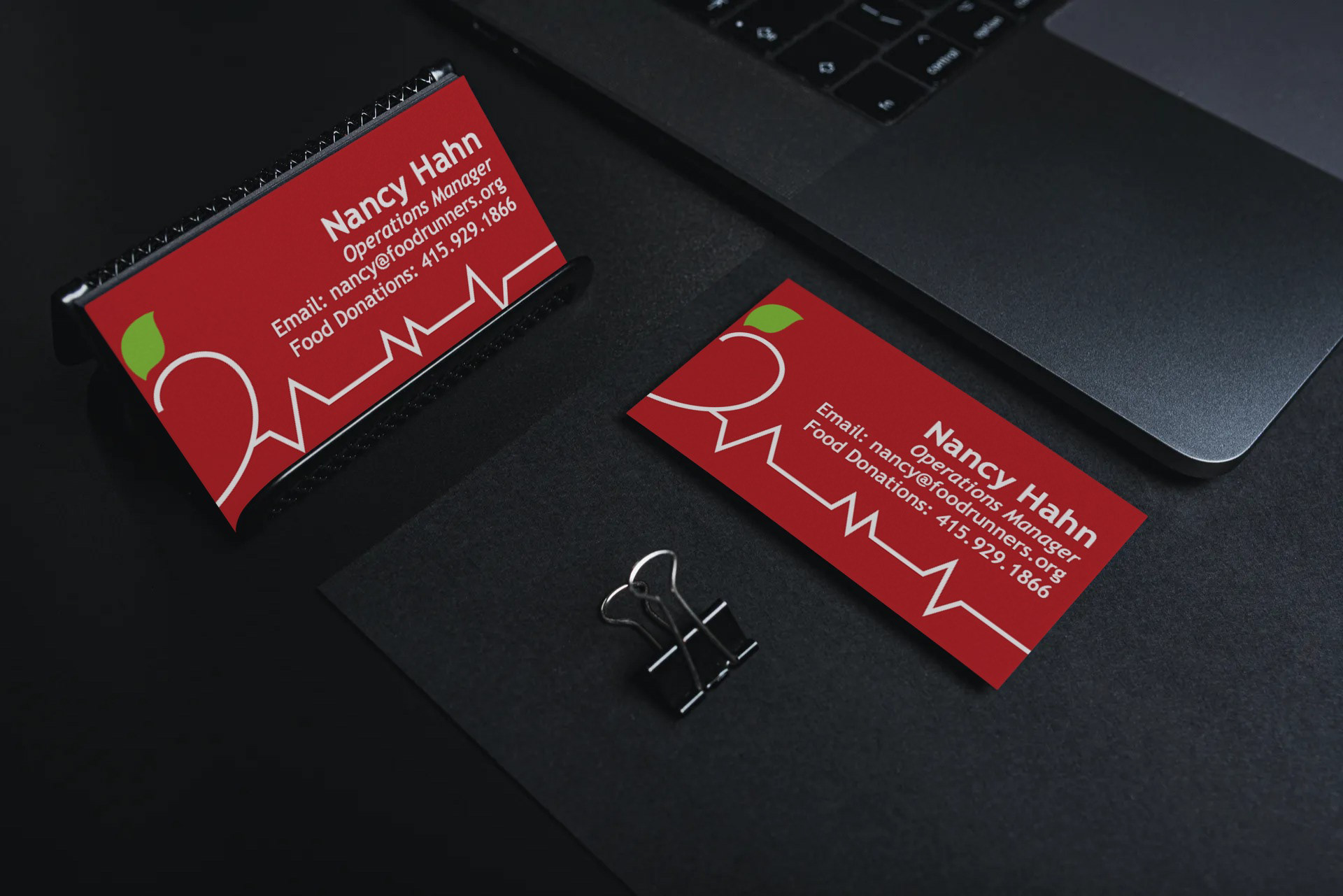
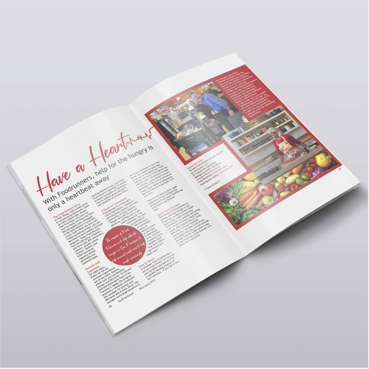
Food Runners Rebranding
This is a project for a class I took at Shoreline College. Our task was to redesign the look and feel of a company's brand. I was assigned Food Runners, an organization Food Runners that fights to alleviate hunger in San Francisco.

Flyer for WSWA
I volunteered to design this flyer for WSWA's back-to-school distribution event. WSWA is a not-for-profit located in Santa Ana, CA that combats poverty in low-income areas. During this event, they gave away over 300 backpacks and lots of school supplies to help children in need.